Economics Section 📈 📉
Welcome to the Economics section!!! My Economics lecturer in university once told me that, in Economics, graphs tell a story better than any words can do, so I tried my best to minimize my yapping in this section(still yapped a lot though), This is essentially a "Mathematics and Economics" that could have been in the mathematics section, but there was so much I wanted to write about I had to make it it's own section. All the graphs here were made by me! along with everything else.
1. Demand and Supply
The law of demand states that when the price asked in exchange for a product is high, the demand for that product will be low, and when the price is low, the demand will be high. For supply, when the price offered to buy a product is high, the quantity supplied will be high, and when it is low the quantity supplied will be low. Demand represents the willingness to pay of consumers, and supply represents the willingness of suppliers to accept a price. They both have an inverse relationship because both parties want to benefit the most out of a transaction, but a market is not about the benefit of one party alone, hence both parties have to compromise, and the best compromise for both is the Equilibrium point \(E_0\).
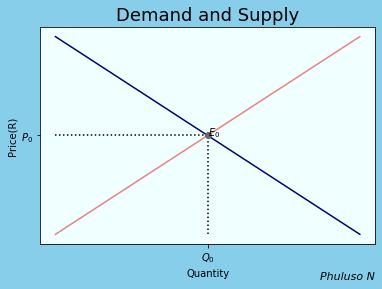
if the price was higher than \(P_0\), then many suppliers would be willing to sell the product, thus quantity demanded for supply would be higher than \(Q_0\), but fewer people would be willing to buy it hence, quantity demanded would be lower than \(Q_0\). That's what the graph shows.
I love this model not only because of how intuitive it is but because a lot of other models in economics rely on the foundations built by it, plus the fact that can be applied to many other different situations on its own.
The reaction to price change of each type good is not same, if prices of both bread and sweets increased for example, people would still keep buying bread, but not sweets. This is referred to as the price elasticity of demand and price elasticity of supply, that is, the sensitivity to price change of demand and supply respectively, they're the slopes or the gradients of the 2 curves. If the graph is steeper, then it is more inelastic and vice versa.
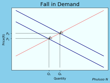
Changes in demand and Supply
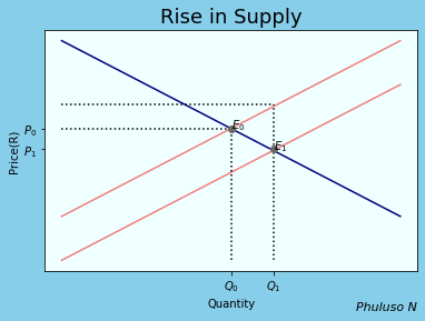
On the left, If a new technology is discovered, for example, and it makes producing things easier and faster, then suppliers would produce more quantity, \(Q_1\). But since nothing has changed with the buyers, they'd have to decrease the prices to prevent an excess of stock, hence a new equilibrium \(E_1\). It would initially benefit buyers more, according to this model anyway. An increase in tax would have the opposite effect (consumers would pay more for less quantity) and the supply curve would shift to the left.
On the right, If there is an economic downturn or an increase in demand for a rival product, the quantity demanded of a product would decline, and suppliers would have to supply less, which would lead to equilibrium \(E_1\). If the population increases or the economy improves however, the quantity demanded would rise and the demand curve would shift to the right .
2. Comparative and Absolute advantage
In economics, a contrast is made between absolute and competitive advantage, absolute advantage refers to the ability to produce more goods or services than someone else, while comparative advantage refers to an ability to produce more goods and services at a lower opportunity cost.
For example, suppose Martha and Henry have to collect some fire logs and catch some fish. Henry can catch 12 fish and collect 8 fire logs in a day, and Martha can catch 6 fish and collect 7 fire logs in a day. This would mean Henry has an absolute advantage in both activities, while Martha has a comparative advantage in collecting fire logs. The graph of the possible combinations of things they could get done in a day would look like this, where A is one possible combination.
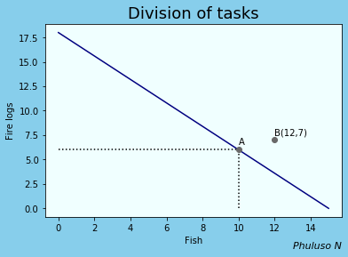
So the question now is, what is the most efficient combination from this graph? According to this model, the 2 will be more productive if each person focuses on something they have a comparative advantage in (i.e., Henry only does fishing and Martha only collects fire logs), as it would result in less opportunity costs, this happens at point B and as you can see, B is higher than any point produced by the line which shows when the two share the tasks instead . This model, like many other microeconomics models, also applies to firms and economies as well, and it implies a firm or an economy will be overall more productive if we all did what we do best, even when there are other people who can do it better than us, really makes you think, huh?.
3. Linear Economic model
An economy is a complex system with many different sectors interacting with and influencing each other, and there's nothing more useful than linear algebra when it comes to complex interacting systems. One economic model that makes use of that is the input-output analysis method invented by Harvard economist Wassily Leontief in the 1930s but still widely used by corporations, cities, and countries for economic planning and forecasting.
Suppose we have a region which consists of 3 industries: The Farming, Manufacturing and service industry, each industry purchases commodities from other industries including itself in order to generate output(i.e., farmers using some of their own crops to feed their cattle, then buying some farming equipment from the manufacturing industry and paying for transport services to transport their goods). We also assume that the economy is in Equilibrium meaning \(total\, expense=total\, income\).
|
Farming |
Manufacturing |
Service |
|
|
Farming |
0.2 |
0.1 |
0.2 |
|
Manufacturing |
0.1 |
0.1 |
0.2 |
|
Service |
0.2 |
0.4 |
0.3 |
|
Exports |
R 1 million |
R 1.2 million |
R 0.8 million |
From the table, we see that the service industry spends(consumes) 0.2 on the farming industry, 0.4 on the manufacturing industry, and 0.3 on itself. On the other hand, they offer(produce) 0.2 services to the farming industry, 0.2 to the manufacturing industry, and 0.4 to the service industry itself. There's also a demand for R 0.8 million worth of service exports.
Now, let total output for farming=\(x_1\), manufacturing=\(x_2\), service=\(x_3\). Since the economy is in Equilibrium, the total expense(used on inputs for production) of the service industry is equal to total revenue(received from total outputs sold). Doing this for every industry, we get the following system:
➀$$ 0.2x_1+0.1x_2+0.2x_3+1=x_1$$ $$0.1x_1+0.1x_2+0.2x_3+1.2=x_2$$ $$0.2x_1+0.4x_2+0.3x_3+0.8=x_3$$
➁$$ 0.8x_1-0.1x_2-0.2x_3=1$$ $$-0.1x_1+0.9x_2-0.2x_3=1.2$$ $$-0.2x_1-0.4x_2+0.7x_3=0.8$$
➂ Which gives us the following augmented matrix $$\left[ \begin{array}{ccc|c} 0.8 & -0.1 &-0.2& 1 \\ -0.1 & 0.9 & -0.2&1.2 \\ -0.2 & -0.4 &0.7& 0.8 \\ \end{array} \right]$$
➃ $$\left[ \begin{array}{ccc|c} 1 & 0 &0& 2.13 \\ 0 & 1 & 0&2.28 \\ 0 & 0 &1& 3.11\\ \end{array} \right]$$
Hence, the Farming industry will have to produce R2.23 million worth of output, the Manufacturing industry will have to produce 2.28 million, and the service industry will have to produce R3.11 million. If there are more industries operating in the economic system, a larger system of equations would be needed. This model also works for a single business with many departments or for a single person trying to make a budget.
Other mathematical properties of the model
The system is of the form \(X=Cx+d\). X is the production vector, C is the consumption vector (it is a stochastic or probability type matrix), x is the feasible solution, and d is the demand vector.
- C is productive if and only if there exists vector \(x\ge 0\) such that \(x\ge Cx\)
- The consumption matrix is productive if for identity matrix I, I-C is invertible and \((I-C)^{-1}\ge 0\)
- If the sum of each row or column is less than 1, then C is productive.
4. Indifference curves
Indifference curves show a combination of 2 things that give the same level of utility, the higher an indifference curve, the higher the utility
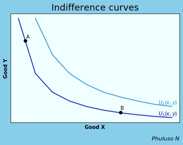
Consider the following indifference curve between good x and good y. From the graph we can see that if a person wants more of good x, they have to sacrifice good y. At A, to keep the same level of utility, you have to sacrifice a lot of good Y in order to get a little of good X. At B you have to sacrifice a lot of good Y to get a little of good X. This is because when 1 commodity is scarce to a person, they have to pay a lot more to get it. \(U_2(x,y)\) is a utility function which represents higher levels of utility for the same goods.
Slope of indifference curves
The slope of the indifference curve is the marginal rate of substitution (MRS), the slope becomes flatter from left to right. On a single indifference curve, change in utility is 0, hence \(dU=0\rightarrow {dU\over dx}dx+{dU\over dy}dy=0 \) (which means change in utility can happen by either changing good X or good Y or both) $$dU=MU_xdx+MU_ydy=0$$(MU=marginal utility, the derivative of utility) $$MU_ydy=-MU_xdx$$ $${dy\over dx} ={-MU_y\over MU_x} =MRS$$ At A MRS > 1 and at B MRS < 1.
5. Isocost Lines
An isocost curve shows the different combinations of factors of production that can be employed with a given total cost. The following is an isocost for capital and labour. The formula for this isocost is: Total cost=Cost of labour + Cost of Capital or \( C = wL + rK \) (w=wages and r= rent)
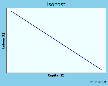
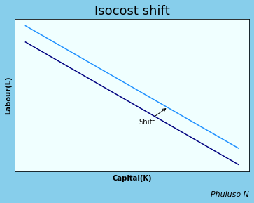
When the cost C increases, the IC curve shifts upwards.. The further the line is from the origin, the higher the cost.
\( slope={wages\over rent }\), a steeper slope implies a higher degree of substitution between rent and wages. Isocost curves help firms determine the most cost effective combination of labour and capital, like how much labour to employ and how much capital to buy.
6. Production Function
The production function refers to the physical relationship between inputs and outputs under given technology, It can be mathematically represented like, \( Y=F(L,K) \) , with L for labour, K for capital, and Y for quantity. The marginal product is when we employ additional units of one input while holding others equal. In this case, there is a marginal product of capital, \( M_{PK}= \frac{\partial Y}{\partial K}=F_K \) and marginal product of labour, \( M_{PL}= \frac{\partial Y}{\partial L}=F_L \) .
We will analyse the behaviour of the production function by first analysing the relationship between output and labour. A typical production function can look like this:
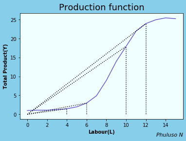
From the graph we can see that the average product of labour, \( Y\over L \) starts by increasing initially, then it begins to decline as labour as labour increases, why does this happen? This is partly because of the "stepping on toes effect", imagine if there was only 1 employer in a restaurant, the restaurant would barely function or serve any customers, but if there were 5 employees it would obviously be more productive, but if it was 100 employees, most employees would not be much help because there is limited space and limited capital for them to actually do work, they would be a liability, hence the diminishing marginal product of labour . There's also the fact that if output grows, population will grow, hence labour will grow, hence average product of labour will decrease in Malthusian(& Thanos) economics.
Relationship between Average Product and Marginal Product of Labour
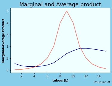
MP cuts AP at its maximum or minimum. When MP=AP the average doesn't change, when MP>AP then AP is increasing, When MP < AP, then AP is decreasing. The relationship between capital(K) and output(Y) is fairly similar.
7. Budget or Feasible Set
A feasible set shows the combinations of things that a decision-maker could choose, given the constraints that they face. Suppose there are two goods X and Y, with prices \(P_X\) and \(P_Y\). The feasible choices that the consumer can make is \(E=P_yY+P_xX \rightarrow Y={E\over {P_x}}-({P_X\over P_Y})\). E is the total expense and \(P_x\) X is a spending on good X.
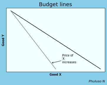
The feasible set is all points inside the curve. For more of good Y, we decrease good X. The higher the good Y is, the higher the marginal product of good X, meaning the opportunity cost of X increases. If \(P_X\) increases, the slope \(P_X\over P_Y\) increases, making the curve steeper. The slope \(P_X\over P_Y\) is the marginal rate of transformation, that is, the rate at which good Y is transformed to good X and Vice Versa. If income increases budget line goes up.
8. Indifference curves and feasible frontier
We can combine the IC curve and the feasible set to solve the constrained choice problem, that is, how we can do what is best for ourselves given our preferences and limitations, and when things we value are scarce.
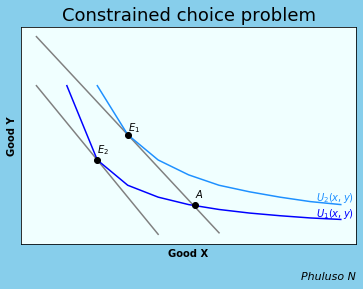
The Indifference curve we choose will be the one with the highest possible tangency, hence our Equilibrium will be at \(E_1\), where Marginal rate of transformation=Marginal rate of substitution. Point A is also a possible point, but not the most preferred since it is on a lower indifference curve. If the consumer's salary were to decrease, the feasible set would shift down, and the consumer would achieve less utility, as they would have to consume less of both goods, hence the new equilibrium would change to \(E_2\)
9. Workers' best response function
The workers' best response shows the amount of work that an employer chooses to perform for each wage that the employer may offer.
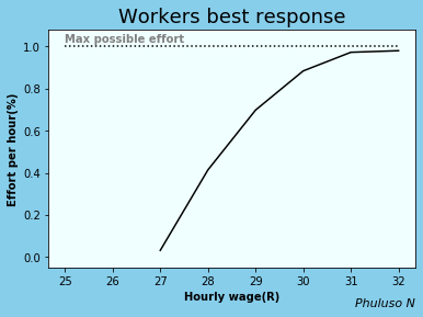
Currently in 2024, R27 is the lowest hourly wage in South Africa. This would be the reservation wage; we assume no one will do any work for anything below that. Now, the more effort a worker is putting in, the more you have to increase their wage to get more effort out of them. If their effort is low however, a little increase is enough to get more effort out of them. The slope of this graph is also the marginal rate of transformation, i.e., transforming money to effort, vice versa.
Shift in best response function.
.
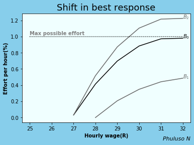
If the probability of getting fired were to increase, and the wage remained constant, the worker would put in more effort, meaning the curve \(B_0\) would shift to \(B_2\). On the other hand, If the unemployment benefits were increased and wages remained constant, the reservation wage would rise, and the curve \(B_0\) would shift to \(B_1\), hence less effort from workers.
10. Firms Isocost lines
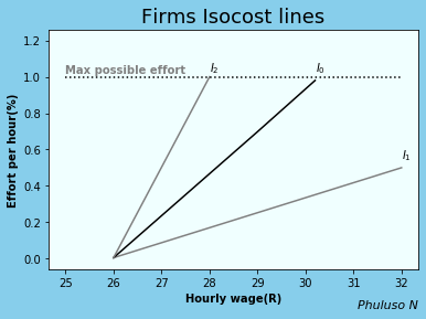
The firm's Isocost curve shows that the employer is willing to pay more to get higher effort \(slope={effort\over wage}\), which is the marginal rate of substitution, it shows the amount of effort per wage the firm is willing to pay. The curve \(I_1\) means the business pays more for the same amount of effort, and \(I_2\) means they pay less for the same amount of effort. Combining the firm Isocost and the Workers best response we get:
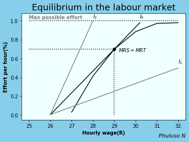
We find that the Equilibrium in the labour market is found at the tangency point where Marginal Rate of Substitution=Marginal Rate of Transformation . At this point, there is not too much pay from the employers and not too little effort from the workers.
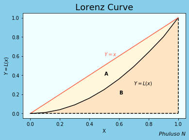
11. Lorenz curve and Gini Index
The Lorenz curve is a graphical representation of income inequality, it is given by \(y=L(x)\), in range [0,1]. We rank all the households in a country by their income, then we compute % of households whose income is at most a given % of the country’s total income(i.e., poorest 30% of households receive at most 9% of the country's income)
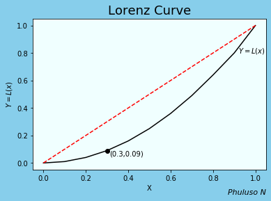
\(y=L(x)=x\) is when a country is perfectly egalitarian, meaning everyone receives the same income. The area between \(y=L(x)\) and \(y=x\) measures how much the income distribution differs from absolute equality.
The Gini index measures the income distribution among the inhabitants of a country, The Gini index is given by \(A\over {A+B}\) from the graph below, where A is the area of inequality and B is the income distribution. \(A\over {A+B}\) = \( {\int_0^1 {x-L(x)}dx}\over{1\over2} \) = \( 2\int_0^1 {x-L(x)}dx \)
Here are top 10 countries with the highest Gini indexes (data source:https://www.statista.com/). For comparison, USA has 39.8% and Russia has 36.0% .
It appears a lot of Southern African countries have high inequalities.
12. The Basic Solow model
Assumptions of the model
The Solow model is an economic model that analyses the economic growth and development of various countries, it helps us tackle the biggest question in macroeconomics, why are other countries poor while others are rich ?
Assumptions of the model
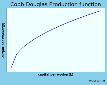
The model is based on 2 equations. The production function which I already talked about here and the capital accumulation equation. The production function is assumed to have a Cobb Douglas form which is: \(Y=F(K,L)=K^αL^{1-α}\) . The Cobb Douglas production form exhibits a constant return to scale(i.e., double input =double output). We assume firms operate under perfect competition(i.e., price takers, large number of firms, etc).
The cost function is given by \(Y=wL+rK\), like the Isocost I explained here. Hence, profit is given by \( F(K,L)-rK-wL\), in which \( {∂F\over∂L}\)=0 and \( {∂F\over∂K}\)=0, will give us: \( w={∂F\over∂L} =(1-α){Y\over L}\) and \( r={∂F\over∂K} =α{Y\over K}\) . this tells us that firms will hire labour until Marginal Product of Labour=wages paid and buy capital until Marginal Product of Capital=rent paid. hence, the share of output paid to labour is \( w{L\over Y}=(1-α)\) , and the share of output paid to capital is \( r{K\over Y}=α\) . Now suppose output per worker is \( y={Y\over L}\) and output per capital \( k={K\over L}\) . $$\therefore y={K^{α}L^{1-α}\over L}={K^{α}\over L^{α}}=k^{α} $$ With the following graph:
The second equation is the capital accumulation : \( \dot{K}=sY-δK\) , Which means change in capital stock \( \dot{K}\) , equals the amount of investments(sY), minus depreciation(δK).(we assume the only use of investment in this economy is to acquire capital).
To write capital accumulation in per worker terms. We use the method of taking logarithms on both sides then find the derivatives. For capital per worker: $$ k={K\over L} \Rightarrow log(k)=log(K)-log(L) $$ $$ \Rightarrow {\dot{k}\over k}={\dot{K}\over K}-{\dot{L}\over L} $$ and for output per worker: $$ y=k^{α} \Rightarrow log(y)=αlog(k) $$ $$ \Rightarrow{\dot{y}\over y}=α{\dot{k}\over k} $$ $$ \Rightarrow{\dot{k}\over k}={sY-δK\over K}-{\dot{L}\over L} $$ $$ \Rightarrow {sY\over K}-δ-n $$
\({\dot{L}\over L}=n\) because we assume the labour force is constant and change in the labour force is proportional to the population growth n. $$\therefore \dot{k} ={sy}-(δ+n)k $$ is our change in capital per worker. It tells us that change in capital per worker is positively affected by the investment per worker, sy, and negatively affected by depreciation per worker, δk, and population growth, nk.
Solving the Solow model: using output per worker and capital accumulation per worker equations, we find the Equilibrium or steady state where change in capital per worker, \(\dot{k}=0\) $$y=k^{α}$$ $$ \dot{k} ={sy}-(δ+n)k $$ $$\Rightarrow 0={sy}-(δ+n)k $$ $$\Rightarrow sk^{α}=(δ+n)k $$ $$\Rightarrow ({s\over {n+ δ}})=k^{1-α} $$ $$\Rightarrow ({s\over {n+ δ}})^{1\over{1-α}}=k $$ $$\Rightarrow ({s\over {n+ δ}})^{α\over{1-α}}=k^{α}=y $$
$$\therefore y=({s\over {n+ δ}})^{α\over{1-α}} $$
According to the Solow steady state \(y\), countries with higher levels of investments(s), low population growth (n) and low rates of capital depreciation(δ) have higher incomes per worker(y). As such, increasing population growth reduces the capital per worker accumulation.A graphical representation:
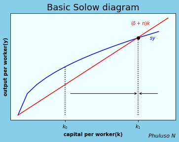
The Solow diagram consists of two curves,investment per person, sy and the amount of new investments per person required to keep the amount of capital per worker constant (n + δ)k . The steady state is where the 2 curves meet, where sy=(n + δ)k. the difference between the 2 curves is change in capital, \(\dot{k}=sy-(n + δ)k\). Suppose an economy begins \(k_0\), then the economy will grow, between \(k_0\) and \(k_1\). but the closer it gets to \(k_1\)(the steady state) , the slower it will grow, then eventually stop \(k_1\). So basically, the economy converges to the steady state. (that is 1 flaw of the basic solow model however, it does not explain sustained economic growth. the model has many refined variations however, which account for some of the flaws basic solow model. )
Here's one example of the steady state of one of the solow variants:
$$y(t)=({s_k\over {n+ δ+g}})^{α\over{1-α}}({µ\over g}e^{ψµ})^{1\overγ}A(t) $$
According to this steady state, the things that help improve an economy are:
- High levels of investment(\(s_k\)).
- High levels of technology(\(A(t)\))(Technology is the key to sustained economic growth, as long as technology keeps improving, the economy will keep growing, it will not be stuck in the steady state, like with the basic Solow model. According to this model, AI development will help improve our lives... ).
- High numbers skilled labour(µ) (that can effectively use said technology) .
- Spending more time acquiring skills\(e^{ψu}\)(education).
- Being an open economy that is able to import(m) capital goods to improve productivity.
- Low levels of capital depreciation(δ)(depreciation is high when there is poor maintenance... *cough* Eskom *cough*).
- Steady population growth rates(g).
13. Economic Bubbles
What is an economic bubble?
A bubble is an economic period where an asset’s price rapidly increases beyond its true value, often due to speculation or high optimism in the asset, followed by a sudden, sharp decline, also referred to as a bubble burst. This phenomenon is referred to as a bubble because the asset’s price during this bubble period is inflated by nothing substantial, like air, and is fragile, able to burst at any moment, much like a bubble. Economic bubbles have been noted to be difficult to detect in real-time until they have burst.
Graphical representation
Suppose there is a competitive market for an asset, the demand curve of the asset will have the equation: \(Q_{t}^{d1} =a-bP_{t}\), and the supply curve will have the equation: \(Q_{t}^{s} =c+dP_{t}\), where \(Q_{t}^{d1}\) is the quantity demanded, \(Q_{t}^{s}\) is the quantity supplied and \(P_{t}\) is the asset price. The functions have parameters a, b, c, and d, all greater than 0. Now, as you can see from the graph below, the market price when the demand is \(Q_{t}^{d1}\) is \(E_1\).
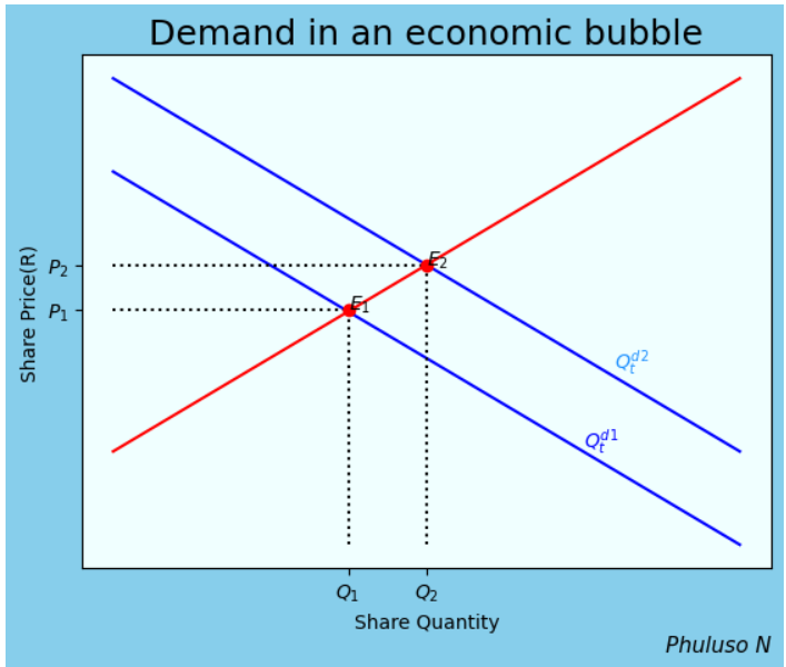
But, if there is suddenly a speculation on the asset's value increasing in the near future. The demand curve will have an equation: \(Q_{t}^{d2} =a-bP_{t}+sE_{t}\). This shows that the demand for the asset depends not only on its price \(P_{t}\), but also on the amount it is expected to increase in the near future(\(sE_{t}\)). The more the price of the asset is expected to rise (\(sE_{t}\)), the greater the quantity of the asset \((Q_{t}^{d2}\)) that people wish to purchase with the expectation of making a profitable future sale. The new market price when the demand is \(Q_{t}^{d2}\) is \(E_2\), with a greater price \(P_2\).
Here are a few examples of some of the most notable bubble bursts in history:
-
Tulip mania (1634-1637)
Regarded as the earliest documented asset bubble. Tulips were highly prized in Europe for their beauty and the prestige they conveyed. In the 1600s, a botanist observed that tulips sometimes bloomed with striking streaks or flames of color from season to season (see the picture on the right below).


In modern times, this phenomenon is referred to as the Tulip breaking virus, but at the time, these infected flowers grew in demand among the wealthy, greatly exceeding their supply and making their prices climb. However, since these flowers had a virus, their lifespan was short, so the supply was gradually declining, increasing their rarity and their prices even more. This was referred to as the Tulip mania. During that period. Houses and businesses were sold, so that tulips could be purchased and resold at higher prices. Some Tulip sales were made multiple times over without ever leaving the ground. The bubble kept growing until 1637, when it burst, and most people could no longer afford even the cheapest flowers and people began having doubts as to whether the prices would keep increasing, and the demand dropped. Another thing that contributed to the burst was the fact that many people had purchased the flowers on loans with the hopes of repaying said loans after reselling their purchased flowers at a higher price, but as prices slowly declined, they were forced to sell them at any price.
2. The Dot-com Bubble (1990-2000)
The period of 1990-2000 was when the internet took the world by storm, more people than ever were using the internet and technology, and it was becoming the new norm, especially in the US. As a result, during this period, there was an excessive increase in stock market valuation in internet services and technology companies, representing the enthusiasm of investors in internet services and the willingness of venture capitalists to invest in IPOs of internet start-ups, many of whose share prices then skyrocketed. Such investor overconfidence and fear of missing out on the growing use of the internet led the shares of dot-com companies to be priced far more than the values that traditional assessment factors would have justified, leading to investors pouring money into debt-ridden companies that had no realistic hope of returning profit.
There are many contributing factors as to why the bubble eventually broke in early 2000, but the most notable one was that after the U.S. Federal Reserve announced a modest increase in interest rates to stave off inflationary pressures, investors in dot-com companies began a panicked sell-off of their holdings, and the shares of many of these companies began to plummet.
The rise of AI is often considered compared to the Dot com bubble, with people often claiming that history will repeat itself.3. The U.S. Housing Bubble
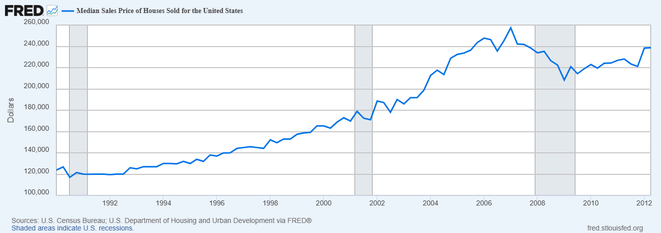
Throughout the 1990s and early 2000s, the US government encouraged homeownership and supported policies that enabled banks and lending institutions to offer mortgages to more people, including those with low credit scores and individuals without the means to follow through on the mortgages they were granted. This led to an increasing demand for mortgages, and as the demand continued to grow rapidly, so did the house prices, forcing people to take high-risk loans.
Financial institutions pooled these risky subprime loans into mortgage-backed securities (MBS) and sold them to investors worldwide. At the time, people who took these high-risk loans believed they were safe because, as the prices of these houses kept increasing, they could always borrow against the increased value of their homes or sell their homes at a profit to pay off their mortgage.
On the other hand, banks and lenders thought they were safe because they
could always repossess the property and sell it for more than the amount of
the original loan; hence, the bubble kept expanding.
However, once interest rates began to rise and housing prices started to
drop moderately in 2006–2007 in many parts of the US, borrowers were unable
to refinance. And adjustable-rate mortgage interest rates rose, leading to
the bubble bursting. The US housing bubble was one of the contributing
factors of the 2008 global recession.
Other bubbles you can learn about:
- The South Sea Bubble of 1720
- Japan's Real estate bubble of the 1980s
- Black Monday (1987).
- Wall Street crash of 1929
- Mississippi monopoly Company bubble of the 1700s
Bibliography
- THE CORE TEAM (2017). The Economy: Economics for a Changing World. [online] CORE Economics Education. Available at: https://www.core-econ.org/the-economy/ [Accessed 16 February 2026].
- JONES, C. I. and VOLLRATH, D. (2013). Introduction to Economic Growth. 3rd ed. New York: W. W. Norton & Company.
- POOLE, D. (2015). Linear Algebra: A Modern Introduction. 4th ed. Stamford, CT: Cengage Learning.
- STEWART, J. (2021). Calculus: Early Transcendentals. 9th ed. Boston, MA: Cengage Learning.
- STEWART, J. (2021). Calculus: Early Transcendentals. 9th ed. Boston, MA: Cengage Learning.
- Ljungqvist, A. and Wilhelm Jr, W.J., 2003. IPO pricing in the dot‐com bubble. The journal of Finance, 58(2), pp.723-752.
- Levitin, A.J. and Wachter, S.M., 2011. Explaining the housing bubble. Geo. LJ, 100, p.1177.